
Pink Light
The exhibition lives from confrontation. It focuses the colour grey in jewellery, which shows distinguished restraint and cool brilliance. This means renouncing the warm shine of gold. Gold stands for the light of the sun, the divine and wealth – silver for the cool light of the moon. Grey, a classy understatement, is in this exhibition contrasted with pink – a strong, intense pink, changing between purple, magenta or fuchsia.
 The contrast between grey and pink refers not only to the mere colour effect, but also to cultural and time-specific connections. Pink stands for the purple of the toga of the Roman emperors or popes as a sign of highest power, but in contemporary fashion pink wanted to shock. On the other hand, the colour grey is associated with ash, concrete, stone, smoke or the inconspicuous mouse.
Read the full article by Cornelie Holzach in the Novemberissue. 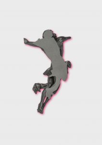
________________________________________________________
captions:
in the slider:
Brooch | Ramón Puig Cuyás, Barcelona | 2011 | Alpaca oxidized| Schmuckmuseum Pforzheim |Photo: Petra Jaschke
in the text:
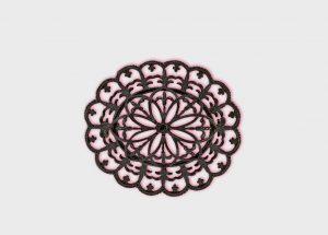
Brooch | Berlin, early 19th Century | Iron| Schmuckmuseum Pforzheim |Photo: Günther Meyer
Brooch »Corpus-Cauda« | Ruudt Peters Stockholm | 2012 | Polyurethane | Schmuckmuseum Pforzheim |Photo: Petra Jaschke
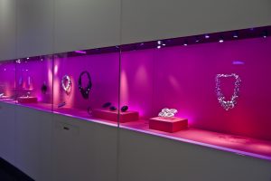
View into the exhibition | Pretty on Pink | Schmuckmuseum Pforzheim | copyright: SMP, Photo: Petra Jaschke